


Currently the contest rating graph is hard to read and understand your progress.
There is a big straight line with contests dating back from 2016--even if you havent attended any around that period.
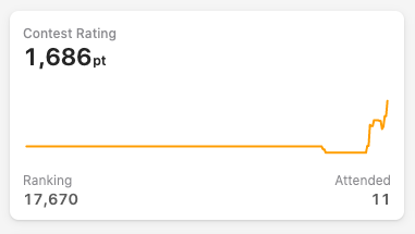
Maybe those unattended contests could be removed and the graph could start from your first attended contest, that way the straight line would be removed and there would be more space in the graph for your relevant progress.
Comments (4)